Why explain it with words when I can just draw it?
Here you will have an overlook on my process. Whether you decided to build your own website, or are just interested to see how it is done, here are the six different steps I go through.
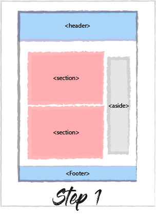
Step 1: Component identification
Depending on the project I am doing, I start from:
- a static Photoshop template: fixes tight constraints on the final UI render, which needs to be pixel-perfect for the given screen resolutions
- an Adobe Experience Design template: focuses mainly on interactions; the UI side is more basic than the PSD template
- a sketched wireframe: leaves room for designing the visual parts and the interactions myself
For the first case, I identify directly on the PSD the different components, such as the header, the footer, the articles... I rename the layers in order to organise it as if it was my future code.
In the other cases, I always identify the blocks of code. This is an important part of the process, as it helps me to build the organisation of my code. If I build the website with the React framework, this step highlights the future components and sometimes even some of the state's properties.
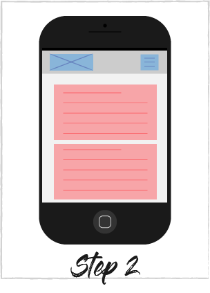
Step 2: Mobile First
Nowadays, everyone uses a mobile phone to check the news, or surfing on the internet That is why the most user-friendly websites start by having the mobile requirements in head.
After identifying the code blocks that I will write, I draw on a paper how I want my app to appear on mobile. This helps me to reorganise my blocks and think about what features I need to add. For instance, there are some components which do not appear on a larger screen, like the sandwich menu button on top of the screen. This needs to be included in the code way before.
If I know that for the styling I will use a framework like Bootstrap, that is the moment when I organise my code blocks in the right order and organise it in rows & columns.
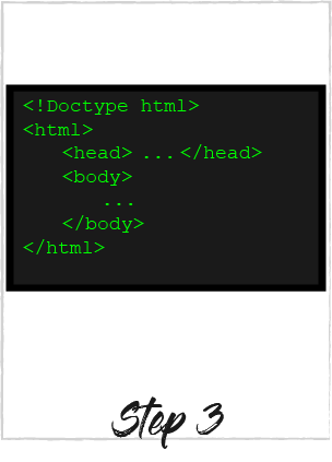
Step 3: Time to code!
First of all, I add the project to a source control, which at the moment is Git. This is very useful especially when you do a mistake and want to come back to a previous code. Then accordingly to the plans I have done, I implement it. My code environment is either Sublime Text or Webstorm.
-
HTML5 implementation
I use the correct HTML5 tags, which match my plans. If I am using the Bootstrap framework, I build my code with rows and columns. I check my works on different browsers and debug it if necessary.
-
React implementation
First of all, I import a React boilerplate and set-up my environment. The boilerplate I use is the one created by Facebook. During my studies, I worked with another boilerplate. These two boilerplates are efficient, but I prefer the one from Facebook which is the fastest.
Then I build my different components in separate Javascript files. I write the HTML-like code blocks using JSX and the rest in ES6.
Finally, I import and export my components to compose the view.
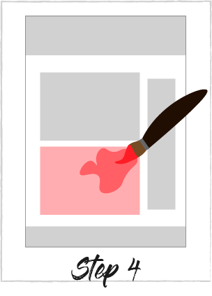
Step 4: Style your page
I use CSS3 for styling. I create two different style pages: one for the general style and one for the media queries. Everything common to all devices screens, such as the colors of the components, the backgrounds or the borders, I define it parts by parts in the general style sheet. Then in the other one, I write the media queries according to four width breaking points:
- under 767px - for small smartphones screens
- from 768 to 991px - for bigger smartphones screens, or landscape oriented small smartphones
- from 992 to 1199px - for tablet screens
- from 1200px - for desktops
Everything linked to the size of the components is written in the media queries. I build part by part the general style first and then I define the style rules from the smallest to the biggest media query. At the same time, I try my code in different browsers (Google Chrome, Opera, Mozilla, Safari...) and in the different screen formats using the developers' tools they offer, and I make the necessary adjustments.
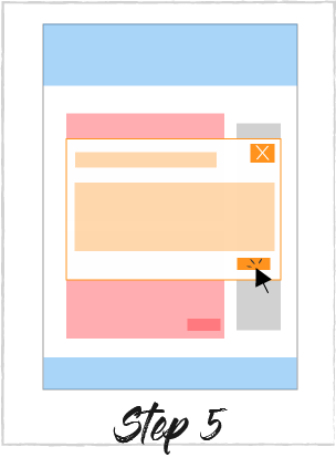
Step 5: Add the interactions
Now that the app has its content and its style, it is time to add some interactions. This is all the actions a user can do on the page. Such as click on a button, fill a form, hover an image, ... The action therefore often involves an animation.
For that, I use either CSS3 or Javascript/jQuery. If the interaction involves only one element, I try to implement it with CSS3, which render is more fluid than Javascript, for example for hover effects. For more complex interactions I use Javascript or jQuery, such as the carousel effect, the menu appearance in small formats or modal creation.
Some interactions can sometimes not be supported by browsers so it is important to test and debug the code in the actual browsers to find that out. I also use caniuse.com to check their support.
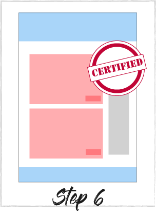
Step 6: Push the code to production
When everything is working in all formats for all browsers, I review my code with my mentor in order to improve it. After that, I push it in production using Git. Finally, I check once more that everything works alright on different devices: my desktop, my tablet and my phone.
If there are some problems I fix it and make notes on the usability of the page. Or if I think of something, I make some small changes in order to improve the user experience.